Building a job-matching platform: from concept to self-hosted MVP - Part II, the React frontend

Hi :-) Nice that you made it here. If you haven’t read Part I of this series, I suggest you do that before reading this article, or at least the beginning of Part I, as it discusses the background info concerning this project. That section is not a lot to read, I promise ;-) OK, now let’s get into how React helped make this app super cool…
The primary job of the frontend is to make the client's UI mockups functional while keeping everything intuitive for the user. I chose to take advantage of React’s built-in capabilities instead of using any state management libraries to keep the project as flexible and as easy to debug as possible. Small libraries, such as react-icons and re-charts were used to provide important visual cues when displaying specific information.
Making authentication feel seamless
A smooth authentication experience requires a reliable bridge between the server's security rules and the frontend's visual state, which I achieved by combining a centralized API layer with global state management.
Centralizing the API logic
To keep the code maintainable, I didn't want to repeat fetch calls with headers in every component so I created an Axios instance that handles the dirty work.
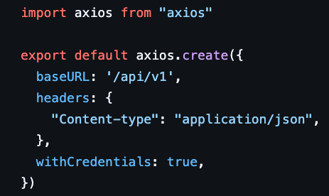
In addition, this setup allows for global response and navigation, which is useful if the backend returns a 401 (Unauthorized) error, for example. The frontend can catch it globally and automatically redirect the user to the login page, guaranteeing security state is always consistent.

(Oauth 2.0 was also implemented so users can easily sign in with their Google or LinkedIn accounts. Users who sign in via this method have their profile image and name automatically completed.)
A global user context for state management
I used React Context to track whether someone is logged in across the entire app. Every page can check if there is a user and what their role is. To make this state easy to consume, I wrapped the context in a custom useUser hook. This means any component can simply call const { user } = useUser() to access profile data without needing to import the Context logic or manage providers manually. By wrapping the application in a single Provider, the useUser hook can allow any nested component to connect to the global state instantly. Every page can now check user to decide what to show.
- Candidates see their job or questionnaire options.
- Recruiters see their match history.
- Visitors see signup prompts.
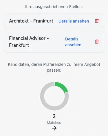
(Above, a view of the recruiter dashboard where an overview of matches and all offered jobs is shown. Offers can always be deleted to make space.)
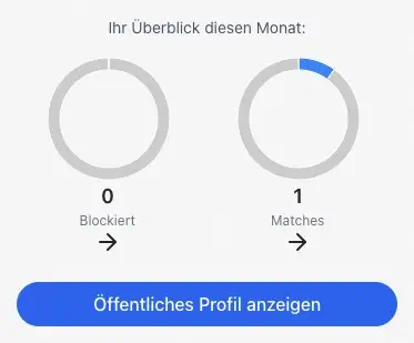
(Above, an overview of activity on the candidate dashboard. Also included in the dashboard, but not shown here, is the coy&paste message they can send to recruiters)

(Above, the job details page, where recruiters or candidates can review each individual job. Candidates are only shown matched jobs and recruiters see all offered jobs, whether they were a match or not.)
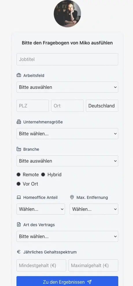
Questionnaires for candidates and for recruiters
As explained in Part I, when a candidate gives access to their profile, the recruiter can fill out their questionnaire to see if there is a match or not.
The questionnaires serve different purposes depending on the user’s role:
For candidates it’s where they can set all their job preferences like the role(s) they are interested in, their salary, and whether or not they want to work remotely.
For recruiters, the questionnaire is their job offer to a specific candidate.
I utilized react-hook-form here to manage the input state. It handles form validation such as ensuring required fields aren't empty or that salary inputs are numbers, without causing unnecessary re-renders of the entire parent component. This keeps the UI fast even on longer forms. The library also integrates easily with custom dropdown components, making the experience smoother for the user.
Honestly though, no one likes filling out forms :-/ Luckily for candidates, their questionnaire is saved not only in the database but also in the UI, so they can always come back to it how they left it. Updating one field won’t affect any of the other fields. Although recruiter questionnaires act as one-time job offers, a similar function could also be used to save their job offers in the UI for future re-use. For example, in case there are many similar roles with the same requirements or several roles from the same company. This would remove some redundancy when filling out the form.
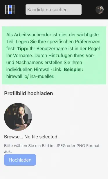
(An info pop-up explains how user slugs are created. In the case of duplicate names, a number is added after the name in the slug. Google and LinkedIn users have their profile images automatically stored in the app.)
(After entering the access password, a recruiter fills out a questionnaire for that candidate. This questionnaire is saved as a job offer while the matching results are processed.)
Displaying errors
Of course, the UI also has to display why something didn’t work. When validation fails whether because there was profanity detected, missing required field or invalid phone number, the error appears in the form in German (the primary user language) with specific details:
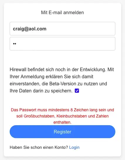
These error messages are not only for form validation but also for authorization. Certain routes are only for candidates, others only for recruiters. So, if someone is trying to access a page they don’t have permission for, the app should display an error message after redirecting them back to the previous page. This helps replace generic statements like “Something went wrong” with clear feedback such as, “You don’t have access to this page.”
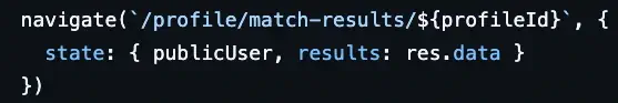
Passing match results through navigation state
When a recruiter gets to the results page, the backend returns information for a matching or non-matching result. I used React Router’s navigation state to keep the data tied to a specific navigation event rather than sitting in the app's permanent memory. It is an efficient way to move information from the questionnaire directly to the results view.
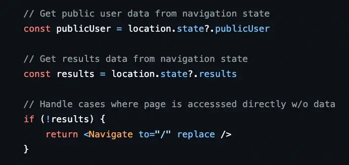
On the results page, the app uses the useLocation hook to access this data. This allows the UI to handle logic based on how the user reached the page:
- Match results: If the state contains data, the component renders the match percentage and the details.
Empty state: If a user tries to bookmark the page or type the URL directly, the state is empty, and the app triggers an automatic redirect.
In the case of a match, where a candidate’s contact info might be shared, this strategy ensures the data is temporary, supporting a "privacy-first" design. Because the information isn't saved to a persistent store, it clears as soon as the user navigates away or refreshes the page. Recruiters don’t have to worry if they navigate away from the results page accidentally because all of their matches and offered jobs are saved in their dashboard automatically.
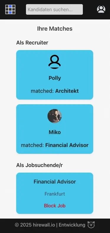
(Above, an example of the "matches" page in mobile view for a user who has both "recruiter" and "candidate" role.)
Showing the results whether it’s a match or not
The results page has two different states to handle:
- Match = Show contact info.
- No match = Show similar candidate previews, if any.
I built a ResultComponent that conditionally renders the imported Match or NoMatch components depending on whether (you guessed it) there is a match or not:
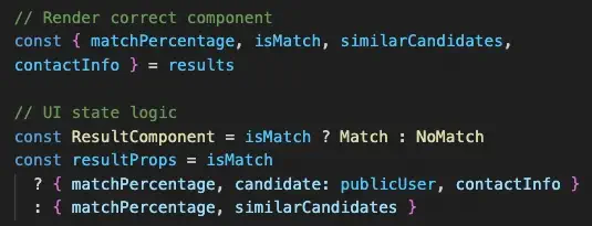
Because of this structure, the results in the return block are readable and easy to maintain:
<ResultComponent {...resultProps} />
Currently, all recruiters have the same experience on their results page but more conditionals can be added in the future as the project grows. For example, similar candidates could be shown only to registered users, creating more of an incentive to make an account, or only to paid users by using an isPremium flag.
Privacy controls that candidates actually understand
The Automations page is where candidates configure what recruiters see when there's a match. The original mockup showed checkboxes for each contact method, which made it clear that an explicit opt-in functionality was desired for each piece of information.
I kept it simple with one state object tracking everything:
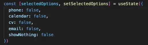
Each checkbox toggles its own value. But there's a special showNothing option that overrides everything. When checked, it clears all other selections and tells the system "I want to see every match for myself before sharing anything." This design emphasizes privacy as the default so users don’t accidentally share information. Candidates can further confirm their selections by viewing their public profile, which shows what recruiters get to see if there is a match. If showNothing is selected, a standard text explaining that the candidate will get in contact is shown.

(The public profile view as seen from a logged-in recruiter. Visitors or users who have just the candidate role cannot enter an access password.)
The file input in the automations form allows for CV uploads. Similar to the questionnaire page where users can upload a profile image, the CVs go to Cloudinary storage since image and pdf files are really big compared to the other data stored in MongoDB.
However, we don't just blindly upload whatever the user selects. The frontend implements strict checks to ensure the file is actually a PDF and falls within a reasonable size limit before the upload process begins. This saves bandwidth and provides immediate feedback to the user if they try to upload an incompatible file, rather than making them wait for a server rejection.
Loading states that feel responsive
The AI matching can take 2-3 seconds, which feels like forever when you're waiting. Instead of just disabling the submit button, I show a spinner so users know something's happening:

This clear visual feedback was made using plain CSS. I made it into a simple <Spinner /> component that can be re-used.
Building transparency and trust into the UI design
Working on this frontend made me realize that most technical decisions eventually show up in the user experience. I kept state management simple with the server as the single source of truth and React Context for client-side needs. The motivation wasn't just a smaller bundle but also about trust. When someone adjusts their privacy settings, the UI needs to reflect that change immediately and accurately. There's no room for the interface to fall behind what's actually stored in the database.
The other thing that stuck with me is that good frontend work is mostly about preventing mistakes. A recruiter shouldn't see contact information they haven't unlocked. A candidate shouldn't be able to send a form before they've filled out required fields. We talk a lot about user-friendly design as if it's mainly visual, but when you're dealing with someone's career and personal information, "user-friendly" really just means the system does what people expect it to do.
Every piece of the frontend serves the original concept: candidates control their privacy, recruiters get accurate matches, and nobody sees information they shouldn't. The UI makes those boundaries visible and understandable, so there's no ambiguity about who knows what, when.
This concludes Part II of the series. In Part III, I'll cover deployment to a Linux VPS, setting up Nginx as a reverse proxy, configuring SSL certificates, and the decisions that come with self-hosting versus managed cloud platforms. Thanks for reading!